Bootstrap 4 and 5 layouts
Note: These features are part of the Visforms Subscription and are not included in the free Visforms version.
Flexible multi-column responsive forms
Bootstrap 4 and 5 are modern and well-developed UI frameworks. With a “mobile first” approach, they offer the possibility to implement extremely flexible responsive layouts.
The Bootstrap 4 and 5 layouts for Visforms offer you the opportunity to exploit the full range of design options of these frameworks. In particular, the Bootstrap 4 and 5 layouts for Visforms add some more design options for your forms that are not available with the other Visforms layouts.
These are:
- Tip text is displayed as a tooltip above the control and not the field label.
- Field label can be hidden for all field types.
- Captcha label can be hidden.
- When using multi-page forms, the additional buttons that are only available in multi-page forms (correction button, back button, check button) can be provided with their own CSS class.
This allows easy styling of the buttons. - In the data editing view in the frontend, additional buttons that are only available in this view (save button, cancel button) can be provided with their own CSS class.
This allows easy styling of the buttons. - All error messages are not displayed as a popup, but below the input field.
Enable Bootstrap 4 layouts
- Go to the “Advanced” tab in the form configuration.
- Under the “Layout” subheading you will find the “UI Framework” option.
- Select the value “Bootstrap 4” there.
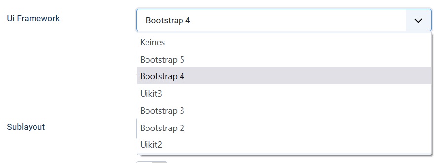
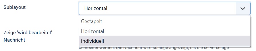
You will then be presented with a new option “Sublayout” where you can choose between 3 versions of the Bootstrap 4 layout:
- Stacked
- Horizontally
- Individually
Enable Boostrap 5 layouts
- Go to the “Advanced” tab in the form configuration.
- Under the “Layout” subheading you will find the “UI Framework” option.
- Select the value “Bootstrap 5” there.
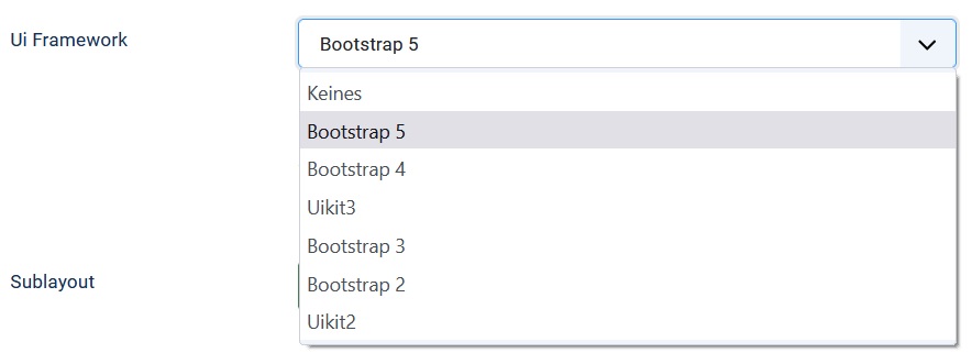
You will then be presented with a new option “Sublayout” where you can choose between 3 versions of the Bootstrap 5 layout:
- Stacked
- Horizontally
- Individually
Stacked layout
In this layout implementation of Bootstrap 4/5, the field label is displayed in a line above the input field. Error messages are displayed below the input field. User-defined texts can be displayed above the label, between the label and the input field, or below the input field. If there is an error message, the custom text is below the error message. The field label can also be completely suppressed.
Horizontal layout
In this layout implementation of Bootstrap 4/5, the field label is displayed in one line along with the input field. The label gets 1/4 and the input field 3/4 of the available space. Error messages are displayed below the input field. User-defined texts can be displayed above or below the input field. If there is an error message, the custom text is below the error message. The display of the field label can also be suppressed. In this case, the space provided for the label remains empty.
Individual layout
The individual layout is very versatile. It allows you to flexibly create forms with very good responsive behavior. If you choose the individual layout version of Bootstrap 4/5, you can not only hide field labels. You can also remove the space reserved for the label in the horizontal layout. The input field is then displayed on the far left.
In particular, you can specify:
- How wide the entire form field is relative to the existing screen width.
The entire form field includes Label, Input Field, Custom Text and Error Message.
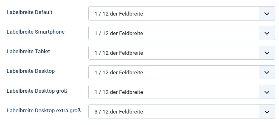
This indirectly controls how many fields are displayed side-by-side in a row. - How much space the field label occupies within the space allotted to the entire field.
More precisely, this means how wide the field label is in relation to the entire field as a percentage.
You have the option of making different specifications for different device sizes.
You can use this to create the following differences
- display 3 fields side by side on a large desktop,
- on a mobile tablet 2 and *On a mobile smartphone only one field per row.
These possibilities come automatically from the way Bootstrap 4/5 implements responsive behavior.
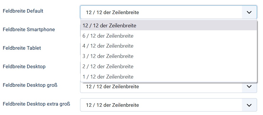
Furthermore, you can control the following individually for each field simply by selecting the percentage width for the field label.
- Is the label displayed in one line with the input field, or
- the label appears above the input field.
Enter a value for the field label width that is less than 100% of the available width. Then the width of the input field is calculated in such a way that the label and input field together fill the entire width.
Enter a value for the field label width that corresponds to 100% of the available width. Then the input field is placed below the label.
User-defined texts and error messages are always displayed left-aligned with the input field. This keeps the form looking properly aligned at all times.
You will find detailed explanations of all options directly in the field configuration with which you can create a highly responsive form in the individual layout.
Assign CSS classes for button
Bootstrap 4/5 knows special CSS classes to format buttons:
- btn-primary,
- btn-secondary,
- btn-success,
- btn info,
- btn-warning,
- btn-danger and
- btn light.
By default, Visforms adds meaningful CSS classes to the buttons so that they are colored. If you don’t like these colors or if the appropriate classes are not implemented in your template’s CSS, you have the following easy way of customization.
Use the following CSS class options to freely design the respective buttons according to your wishes:
- in the form configuration or
- in the field configuration for fields of type “Submit” or “Reset”.
Load Bootstrap 4 CSS for forms
In principle, Visforms also offers you the option of loading the Bootstrap 4 standard CSS separately. To do this, activate the option “Load Bootstrap CSS for forms”.
This can be interesting, for example, if you are using a template that does not use Bootstrap CSS at all. It becomes problematic if your template implements an older (Bootstrap 2 or 3) or newer (Bootstrap 5) version of the Bootstrap CSS. Then there are probably incompatibilities between the CSS of your template and the Bootstrap 4 CSS.
As a rule, this then leads to an unsatisfactory display of the forms. In this case, select the UI framework in the form configuration that matches your template.