Set up multi-column layout for Bootstrap 3
Note: These features are part of the Visforms Subscription and are not included in the free Visforms version.
Note: The multi-column form layout is based on the Bootstrap 3 grid. You can therefore only use this layout if your website has a template that implements the Bootstrap 3 grid.
Basics
The Bootstrap 3 Grid divides the web page into rows and each row into 1 - 12 columns.
Layout is generated in rows
This means that the layout is ultimately created row by row. Each row is then divided into columns, each containing a form field consisting of a label and a control. The columns are containers that contain the label and the control.
In a two-column layout, the container for the 1st form field is displayed in the 1st row in the left column, the container for the 2nd form field is displayed in the 1st row in the right column. The container for the 3rd form field is in the second line on the left, and the container for the 4th field in the second line on the right - and so on. For each row you have the option of specifying how many columns it should contain. Overall, this results in an extremely flexible system.
Field container in the grid system

You can use the multi-column Bootstrap 3 layout to customize the design of multi-column forms. In this case, however, you should really be familiar with the Bootstrap Grid System. More on this in: Bootstrap Grid System .
The multi-column layout is responsive and uses the col-sm-* classes. With them, the form fields are automatically displayed one below the other and not in multiple columns on small devices.
For which forms is the multi-column layout suitable?
The multi-column Bootstrap 3 layout is well suited for creating forms that primarily use text input fields (field types: text, email, password, URL, number).
The design looks particularly good if you set the “Label options” to “Hide label” for these fields. The label is then displayed as a placeholder in the input and disappears when the user starts typing.
Checkboxes, listboxes, file uploads and text areas also fit quite well into the multi-column layout.
With fields of the radio button or checkbox group type, the multi-column layout quickly reaches its limits. However, these can usually be used with a little skill.
The more uniform the form, the better it looks in the multi-column layout.
For which forms is the multi-column layout not suitable?
Multi-column layout does not work with forms containing “Conditional Fields”. Because showing and hiding the conditional fields completely messes up the layout. Creating multi-column forms with conditional fields requires finesse and a lot individual fine adjustment.
Having both labeled and unlabeled fields in a row at the same time results in an inconsistent layout.
Texts in the form (user-defined texts of the fields) quickly lead to the multi-column layout no longer looking good. Likewise, radio button and checkbox groups with many options are difficult to fit.
The multi-column layout is also not very suitable for displaying forms in modules. This is because the modules are usually too narrow.
Note: Please note that not every form can be displayed in multiple columns. The multi-column layout can simply "break" with poor configuration and/or inappropriate fields. You just have to try it to see if it works well for a specific form.
A simple two-column form
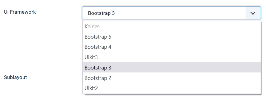
Go to the “Advanced” tab in the form configuration. Under the “Layout” subheading you will find the “UI Framework” option. Set this to “Bootstrap 3”.

A list box for selecting the “sublayout” then becomes visible. Set the “Sublayouts” option to “Custom”.

This setting alone means that two form fields are now displayed per line. The two columns have the same width. Within the container that contains a field, the label is displayed above the control. So you have a two-line display within the container. If you have deactivated the display of the field label, the field fills the entire width of the container in a single line.
Determine the number of fields per column
For each field, you can determine how much space is allocated to it within a row.
Assign units per row to a field
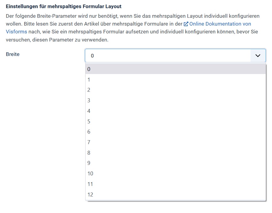
To do this, go to the “Advanced” tab in the field configuration. Here you will find a parameter “Width”. Select a value between 1 and 12 from the list box. This value corresponds to the number of units that will be assigned to this field in its row. Since each row consists of 12 units, this means that a value of 4 takes up 1/3 of the row, a value of 6 takes up half the row, and a value of 12 takes up the entire row.

Line not always completely filled
Visforms automatically calculates for each field whether it still fits into the current line based on its selected width. If it no longer fits, a new line is automatically started. It is therefore also possible that a line is not completely filled due to the selected field widths.
Here’s an example:
Field1 has width 5, field2 has width 5, field3 has width 3.
Field 3 is thus written on a new line (13 = 5 + 5 + 3 > 12).
Therefore, only 10 of 12 units are filled in the 1st line.
Required fields and the asterix
Mandatory fields are marked with an asterix (the star *) in the form. Unfortunately, dealing with this mandatory field asterisk is somewhat difficult in the multi-column Bootstrap 3 layout.
If the label is visible, the mandatory field asterisk is often attached to the field label in the multi-column layout. If you have selected the “Hide label” field option, the mandatory field asterisk is displayed on the right above the control. The mandatory field asterisk means that the field takes up the same amount of space as a field with a label.
Visforms also offers you the option of completely dispensing with the display of the mandatory field asterisk. Of course, it is still checked that a mandatory field contains a value. You have to try out in detail for your specific form which settings deliver the best and also the best-looking result.
The form buttons
The settings for multi-column layout are not evaluated for the button field types. Button field types include Submit, Reset, and Image Submit types. All buttons are placed in their own row and next to each other in all layouts.