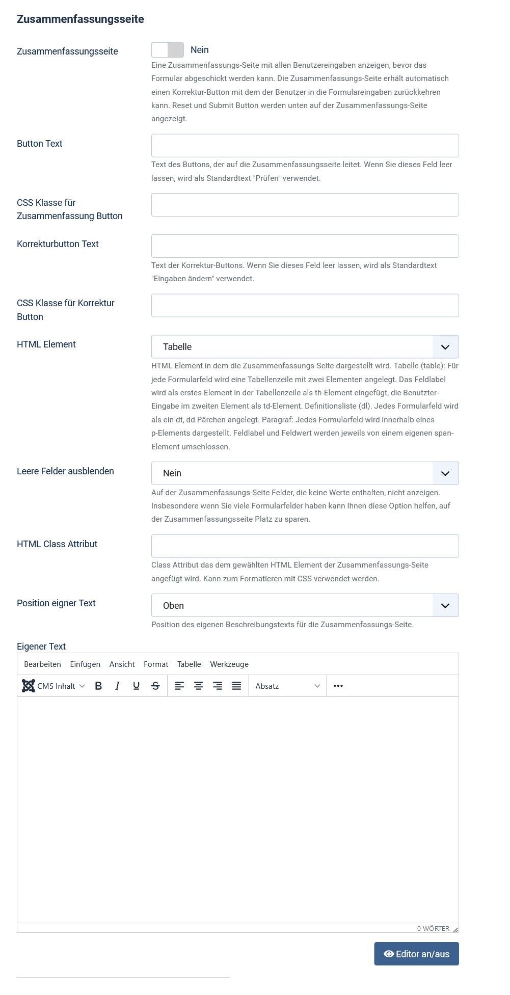
The summary page
Note: These features are part of the Visforms Subscription and are not included in the free Visforms version.
For a better understanding, we recommend reading the documentation completely and using the
Section Introduction
to start.
Relationships explained in earlier sections of the documentation are not repeated here.
Summary also for one-page forms
With this extension you also have the possibility to add an overview page to one-page forms. The overview page is displayed to the user before he can click the submit button. If you want, you can also display a progress bar.
The layout of the summary page is controlled by form options

With the help of the options Button Text and Correction Button Text you can assign individual text for the two buttons:
- The button that redirects to the summary page.
- The button that takes you back to the form from the summary page if you want to correct entries.
If you leave these options blank, the text “Check” and “Change entries” is used. With the respective “CSS class” options, you can add your own CSS classes to the buttons for individual styling.
You can control the layout of the summary using the HTML Element and HTML Class Attribute options. You have the choice between
- table layout,
- Representation as a so-called definition list dl,
- unordered list ul,
- ordered list ol,
- simple paragraphs p.
The Hide Empty Fields option allows you to do the following. Do not show fields for which the user has not entered anything in the summary page. For example, empty fields are conditional fields that remain hidden due to the user’s specific selection.
If this option has been activated, you will also be offered the following option. You can specify that fields of the Calculation type are considered “empty” if they contain the value 0.
The Custom Text option allows you to add your own text to the summary page. You can then choose whether this text should appear at the top or bottom of the page. This gives you the following opportunity. Give the user of your website additional information about what the user should do with the summary page and what to do next.
If the summary page doesn’t look good
If you have selected “table” as the HTML element for the summary page and are using a bootstrap template on your web page, you should definitely enter the value “table” in the HTML Class Attribute option. This ensures that any formatting that Bootstrap automatically applies to tables is actually applied.
You can also refine the design of templates from other UI frameworks by adding a suitable class attribute. And you can use a custom class attribute to write specific custom CSS for the summary. Include this custom CSS in your own Visforms CSS override file. More on this in: Customize layout with CSS.
An example form
In this sample form, we’ve also used Field Separator fields to add a bit of explanatory text at the top of each page of the form: Multi-page form.